South American cold surge of 2005
See also
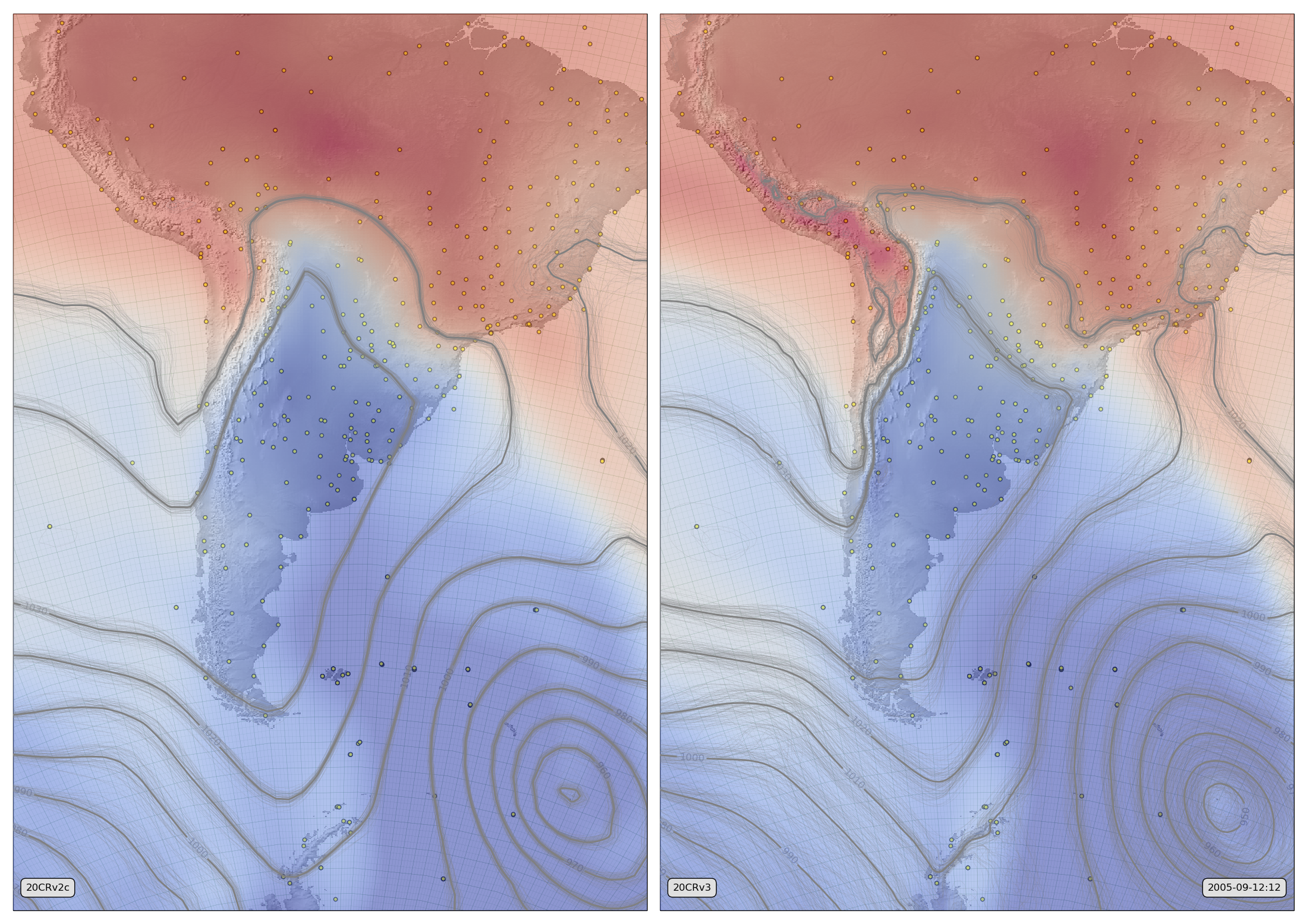
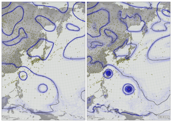
MSLP contours and 850hPa temperature field from 20CRv2c (left) and 20CRv3 (right).
The thin lines are MSLP contours from each of 56 ensemble members. The thicker lines are contours of the ensemble mean. The background colour field shows the ensemble mean temperature at 850hPa. The small circles mark pressure observations assimilated while making the fields shown.
Code to make the figure
Download the data required:
#!/usr/bin/env python

import IRData.twcr as twcr
import datetime

dte=datetime.datetime(2005,9,1)

twcr.fetch('observations',dte,version='4.5.2')
twcr.fetch('prmsl',dte,version='4.5.2')
twcr.fetch('tmp',dte,level=850,version='4.5.2')

twcr.fetch('observations',dte,version='2c')
twcr.fetch('prmsl',dte,version='2c')
twcr.fetch('t850',dte,version='2c')
Make the figure:
#!/usr/bin/env python

# South America plot
# MSLP and 850hPa temperature from 20CRv2c and v3

import math
import datetime
import numpy
import pandas

import iris
import iris.analysis

import matplotlib
from matplotlib.backends.backend_agg import \
             FigureCanvasAgg as FigureCanvas
from matplotlib.figure import Figure

import cartopy
import cartopy.crs as ccrs

import Meteorographica as mg
import IRData.twcr as twcr

# Date to show
year=2005
month=9
day=12
hour=12
dte=datetime.datetime(year,month,day,hour)

# Landscape page
fig=Figure(figsize=(22,22/math.sqrt(2)),  # Width, Height (inches)
           dpi=100,
           facecolor=(0.88,0.88,0.88,1),
           edgecolor=None,
           linewidth=0.0,
           frameon=False,
           subplotpars=None,
           tight_layout=None)
canvas=FigureCanvas(fig)

# South America-centred projection
projection=ccrs.RotatedPole(pole_longitude=120, pole_latitude=125)
scale=25
extent=[scale*-1,scale,scale*-1*math.sqrt(2),scale*math.sqrt(2)]

# Two side-by-side plots
ax_2c=fig.add_axes([0.01,0.01,0.485,0.98],projection=projection)
ax_2c.set_axis_off()
ax_2c.set_extent(extent, crs=projection)
ax_3=fig.add_axes([0.505,0.01,0.485,0.98],projection=projection)
ax_3.set_axis_off()
ax_3.set_extent(extent, crs=projection)

# Background, grid and land for both
ax_2c.background_patch.set_facecolor((0.88,0.88,0.88,1))
ax_3.background_patch.set_facecolor((0.88,0.88,0.88,1))
mg.background.add_grid(ax_2c)
mg.background.add_grid(ax_3)
land_img_2c=ax_2c.background_img(name='GreyT', resolution='low')
land_img_3=ax_3.background_img(name='GreyT', resolution='low')

# Observations
obs=twcr.load_observations_fortime(dte,version='2c')
obs=obs.loc[((obs['Latitude']<10) &
                 (obs['Latitude']>-90)) &
              ((obs['Longitude']>270) &
                 (obs['Longitude']<330))].copy()
mg.observations.plot(ax_2c,obs,radius=0.15)

# MSLP
prmsl=twcr.load('prmsl',dte,version='2c')

# Contour spaghetti plot of MSLP ensemble
mg.pressure.plot(ax_2c,prmsl,scale=0.01,type='spaghetti',
                   resolution=0.25,
                   levels=numpy.arange(870,1050,10),
                   colors='grey',
                   label=False,
                   linewidths=0.1,
                   zorder=150)

# Add the ensemble mean - with labels
prmsl_m=prmsl.collapsed('member', iris.analysis.MEAN)
mg.pressure.plot(ax_2c,prmsl_m,scale=0.01,
                   resolution=0.25,
                   levels=numpy.arange(870,1050,10),
                   colors='grey',
                   label=True,
                   linewidths=2,
                   zorder=200)

# Show the ensemble mean T850 with a colour overlay
t850=twcr.load('t850',dte,version='2c')
t850_m=t850.collapsed('member', iris.analysis.MEAN)
mg.precipitation.plot(ax_2c,t850_m,resolution=0.25,sqrt=False,
                      cmap=matplotlib.cm.get_cmap('coolwarm'),
                      vmin=265,vmax=295,alpha=0.5,zorder=100)


mg.utils.plot_label(ax_2c,'20CRv2c',
                     facecolor=fig.get_facecolor(),
                     x_fraction=0.02,
                     horizontalalignment='left',
                     zorder=500)

# V3 version
obs=twcr.load_observations_fortime(dte,version='4.5.2')
obs=obs.loc[((obs['Latitude']<10) &
                 (obs['Latitude']>-90)) &
              ((obs['Longitude']>270) &
                 (obs['Longitude']<330))].copy()
mg.observations.plot(ax_3,obs,radius=0.15)

# MSLP
prmsl=twcr.load('prmsl',dte,version='4.5.2')

# Contour spaghetti plot of MSLP ensemble
mg.pressure.plot(ax_3,prmsl,scale=0.01,type='spaghetti',
                   resolution=0.25,
                   levels=numpy.arange(870,1050,10),
                   colors='grey',
                   label=False,
                   linewidths=0.1,
                   zorder=150)

# Add the ensemble mean - with labels
prmsl_m=prmsl.collapsed('member', iris.analysis.MEAN)
mg.pressure.plot(ax_3,prmsl_m,scale=0.01,
                   resolution=0.25,
                   levels=numpy.arange(870,1050,10),
                   colors='grey',
                   label=True,
                   linewidths=2,
                   zorder=200)

# Show the ensemble mean T850 with a colour overlay
t850=twcr.load('tmp',dte,level=850,version='4.5.2')
t850_m=t850.collapsed('member', iris.analysis.MEAN)
mg.precipitation.plot(ax_3,t850_m,resolution=0.25,sqrt=False,
                      cmap=matplotlib.cm.get_cmap('coolwarm'),
                      vmin=265,vmax=295,alpha=0.5,zorder=100)

mg.utils.plot_label(ax_3,'20CRv3',
                     facecolor=fig.get_facecolor(),
                     x_fraction=0.02,
                     horizontalalignment='left',
                     zorder=500)

mg.utils.plot_label(ax_3,
              '%04d-%02d-%02d:%02d' % (year,month,day,hour),
              facecolor=fig.get_facecolor(),
              x_fraction=0.98,
              horizontalalignment='right',
              zorder=500)

# Output as png
fig.savefig('CS_V3vV2c_%04d%02d%02d%02d.png' %
                                  (year,month,day,hour))