Kon-Tiki Expedition (1947): Pressure observations
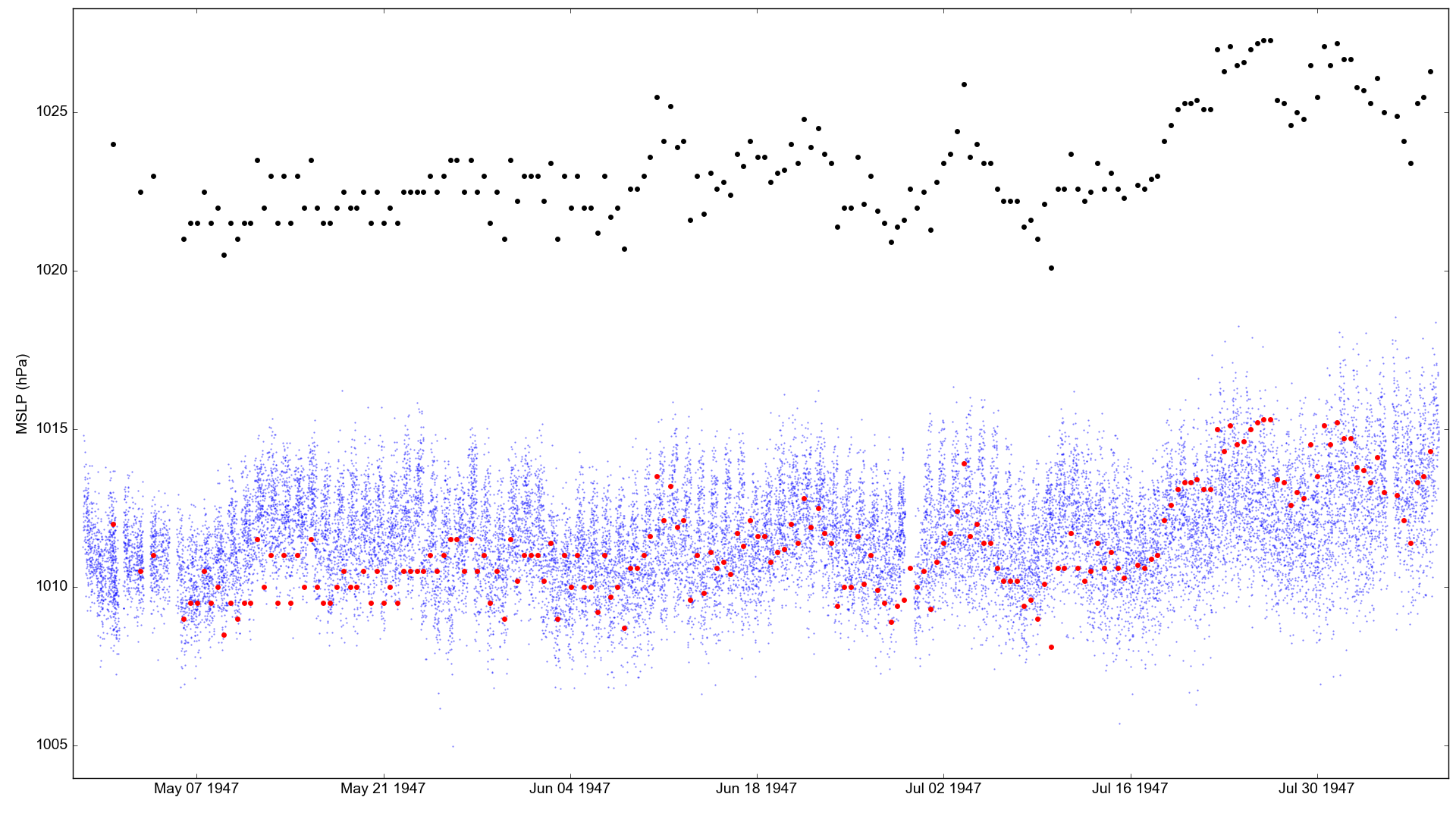
Atmospheric pressure observations made by the Kon-Tiki (black dots), compared with co-located MSLP in the 20CRv3 ensemble (blue dots). The red dots are the observations with a constant offset of 12hPa subtracted.
The apparent bias in the observations is large. I’m assuming the observations come from aneroid barometer, so no temperature or gravity correction has been made. If they were really from a mercury barometer, the corrections would reduce the bias by about half (temperature and latitude vary little across the voyage).
Get the 20CRv3 data for comparison:
import IRData.twcr as twcr
import datetime

for month in (4,5,6,7,8):
    dtn=datetime.datetime(1947,month,1)
    twcr.fetch('prmsl',dtn,version='4.5.1')
Extract 20CRv3 MSLP at the time and place of each IMMA record. Uses this script:
./get_comparators.py --imma=../../../imma/Kon-Tiki_1947.imma --var=prmsl
Make the figure:
#!/usr/bin/env python

# Plot a comparison of a set of ship obs against 20CRv3

# Requires 20CR data to have already been extracted with get_comparators.py

obs_file='../../../../imma/Kon-Tiki_1947.imma'
pickled_20CRdata_file='20CRv3_prmsl.pkl'

import pickle
import IMMA
import datetime
import numpy

import matplotlib
from matplotlib.backends.backend_agg import \
                 FigureCanvasAgg as FigureCanvas
from matplotlib.figure import Figure

# Load the data to plot
obs=IMMA.read(obs_file)
rdata=pickle.load(open(pickled_20CRdata_file,'rb'))
ob_dates=([datetime.datetime(o['YR'],o['MO'],o['DY'],int(o['HR']))
                  for o in obs if
                (o['YR'] is not None and
                 o['MO'] is not None and
                 o['DY'] is not None and
                 o['HR'] is not None)])
ob_values=[o['SLP'] for o in obs if o['SLP'] is not None]
rdata_values=[value/100.0 for ensemble in rdata for value in ensemble[3]]

# Set up the plot
aspect=16.0/9.0
fig=Figure(figsize=(10.8*aspect,10.8),  # Width, Height (inches)
           dpi=100,
           facecolor=(0.88,0.88,0.88,1),
           edgecolor=None,
           linewidth=0.0,
           frameon=False,
           subplotpars=None,
           tight_layout=None)
canvas=FigureCanvas(fig)
font = {'family' : 'sans-serif',
        'sans-serif' : 'Arial',
        'weight' : 'normal',
        'size'   : 14}
matplotlib.rc('font', **font)

# Single axes - var v. time
ax=fig.add_axes([0.05,0.05,0.945,0.94])
# Axes ranges from data
ax.set_xlim((min(ob_dates)-datetime.timedelta(days=1),
             max(ob_dates)+datetime.timedelta(days=1)))
ax.set_ylim((min(min(ob_values),min(rdata_values))-1,
             max(max(ob_values),max(rdata_values))+1))
ax.set_ylabel('MSLP (hPa)')

# Ensemble values - one point for each member at each time-point
t_jitter=numpy.random.uniform(low=-6,high=6,size=len(rdata[0][3]))
for i in rdata:
    ensemble=numpy.array([v/100.0 for v in i[3]]) # in hPa
    dates=[i[0]+datetime.timedelta(hours=t) for t in t_jitter]
    ax.scatter(dates,ensemble,
                    10,
                    'blue', # Color
                    marker='.',
                    edgecolors='black',
                    linewidths=0.0,
                    alpha=0.5,
                    zorder=50)

# Observations
ob_dates=([datetime.datetime(o['YR'],o['MO'],o['DY'],int(o['HR']))
                  for o in obs if
                (o['SLP'] is not None and
                 o['YR'] is not None and
                 o['MO'] is not None and
                 o['DY'] is not None and
                 o['HR'] is not None)])
ob_values=([o['SLP']
                  for o in obs if
                (o['SLP'] is not None and
                 o['YR'] is not None and
                 o['MO'] is not None and
                 o['DY'] is not None and
                 o['HR'] is not None)])
ax.scatter(ob_dates,ob_values,
                100,
                'black', # Color
                marker='.',
                edgecolors='black',
                linewidths=0.0,
                alpha=1.0,
                zorder=100)
ob_values_shifted=[value-12 for value in ob_values]
ax.scatter(ob_dates,ob_values_shifted,
                100,
                'red', # Color
                marker='.',
                edgecolors='black',
                linewidths=0.0,
                alpha=1.0,
                zorder=100)

fig.savefig('pressure_comparison.png')